Out of Order
Framing architecture through a surreal lens.
Industry
Creative Arts
Out of Order is an architectural photography and videography club founded by two architects and longtime friends. It explores the relationship between space, perspective and perception through photography and film, creating and documenting unexpected situations within architectural environments. The brief was to establish a distinctive identity for the club as it began building its presence. The system needed to extend across photography, film, social media, presentations, merchandise and future creative projects, while allowing the work itself to remain the primary focus. The challenge was to express the tension between architectural documentation and surreal reinterpretation at the heart of Out of Order. Structure meets experimentation, reality meets surrealism, and familiar spaces are presented through unfamiliar perspectives. This led to a positioning centred on alternative ways of seeing. Out of Order uses photography and videography to explore how a space can be perceived differently when its context, perspective or visual language is altered.
Scope of Work
Brand Strategy, Brand Positioning, Identity Design, Social Media Templates, Merchandise Design, Brand Guidelines
Shift in Perspective
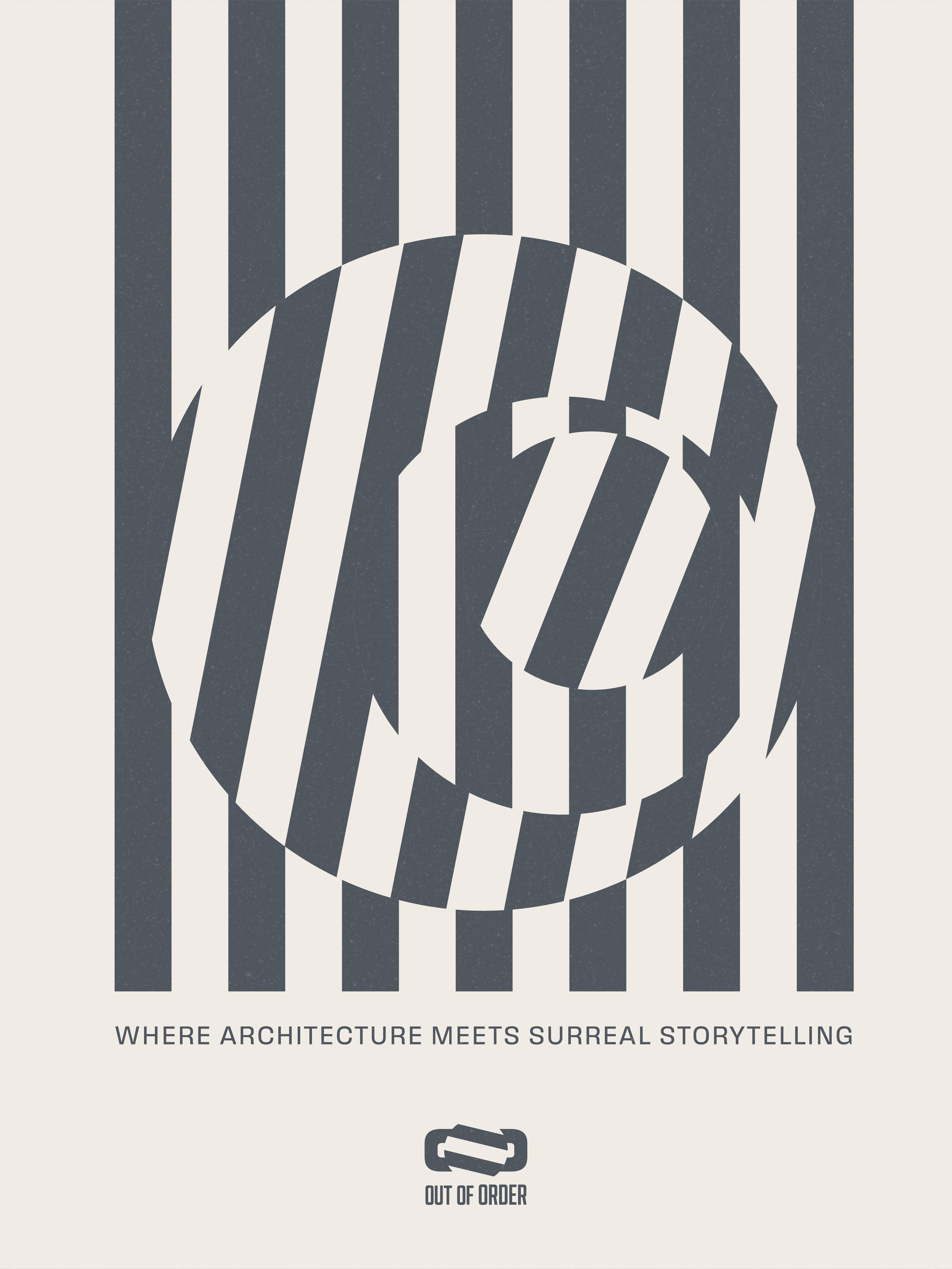
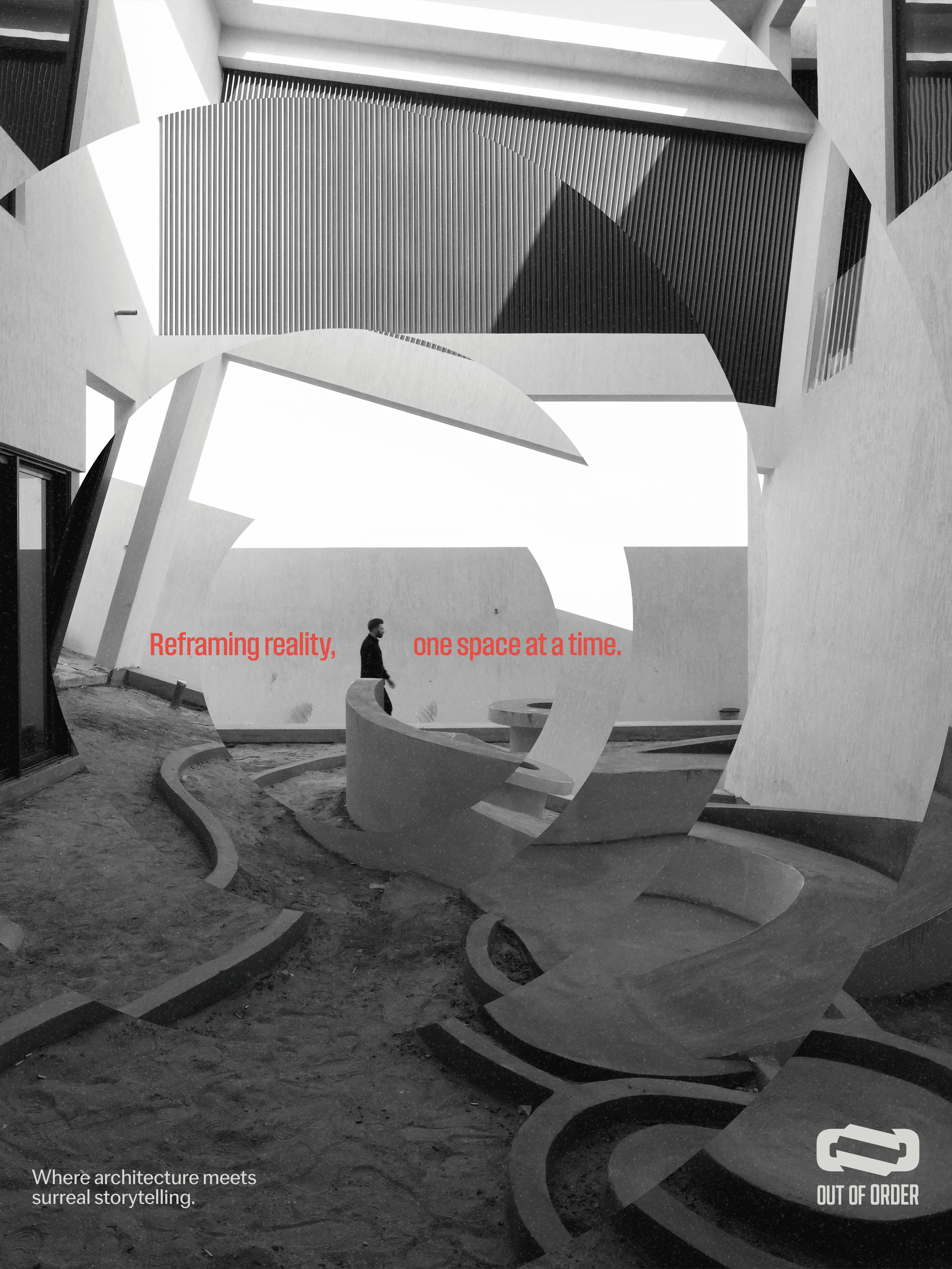
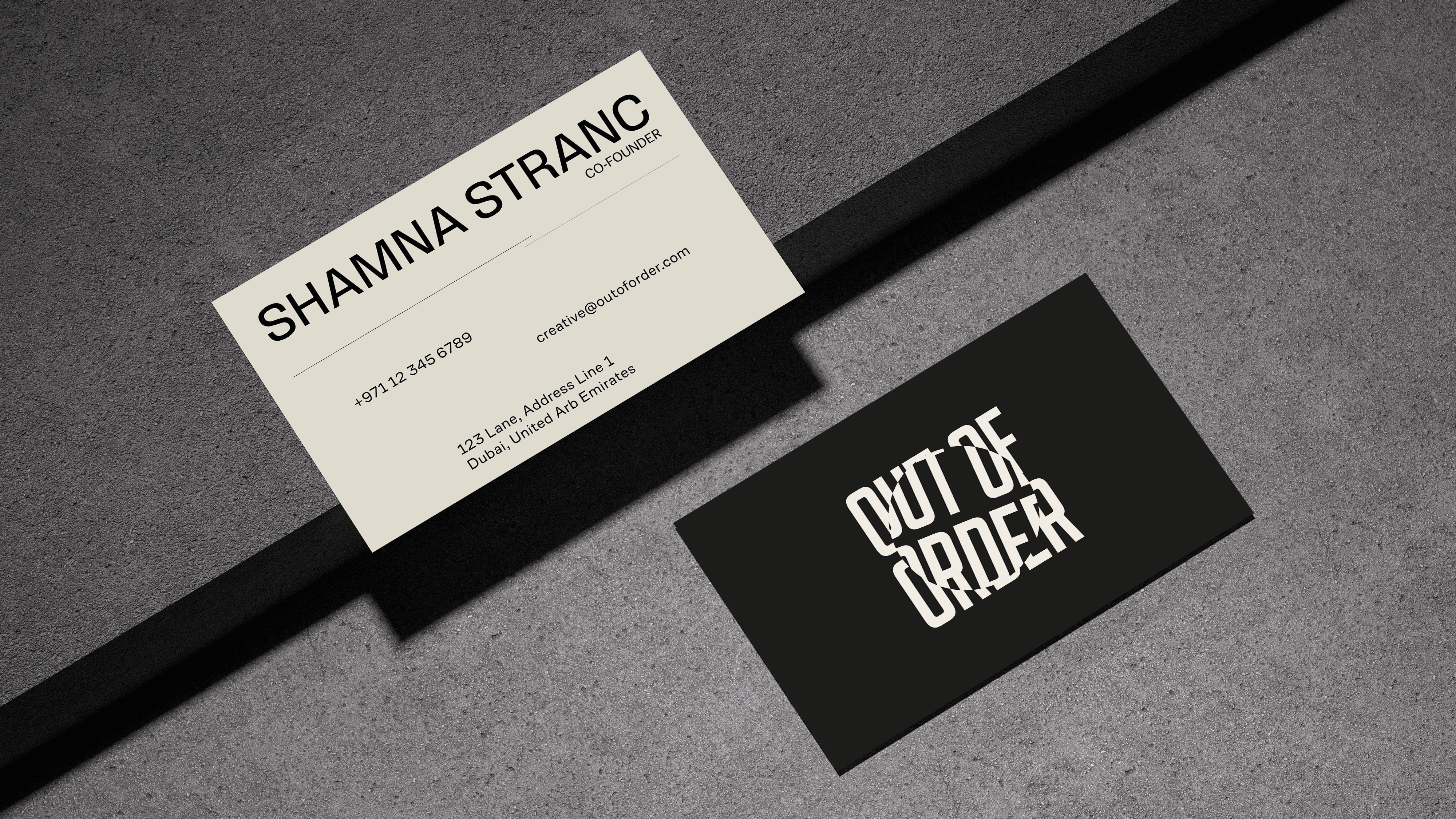
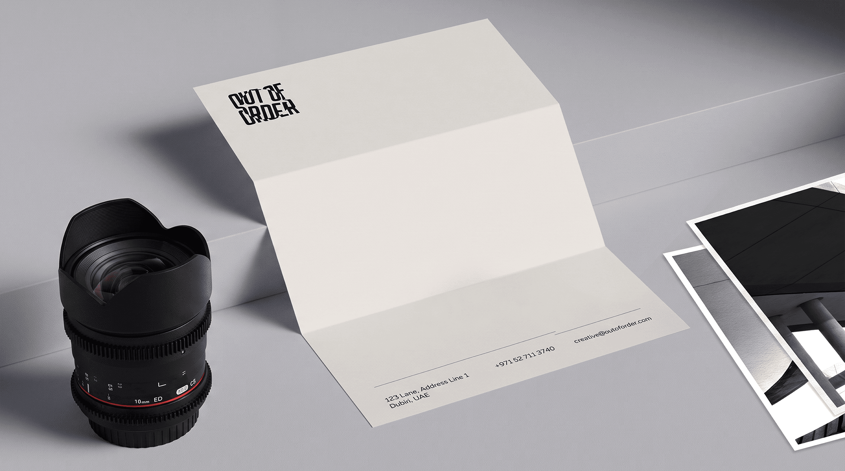
The identity begins with the idea that perception can change without the subject itself changing. A familiar space can feel entirely different when viewed through another lens. This became the foundation for a design system that feels recognisable at first, but reveals something unexpected on closer inspection. The logo combines a custom wordmark with the visual language of a camera lens. The circular form references the lens as both a physical tool and a metaphor for perspective. This idea extends beyond the primary mark, becoming a framing device used across imagery, typography and layouts. It creates a consistent way to direct attention while reinforcing the idea that every frame can offer another way of seeing.
Architects of Distortion
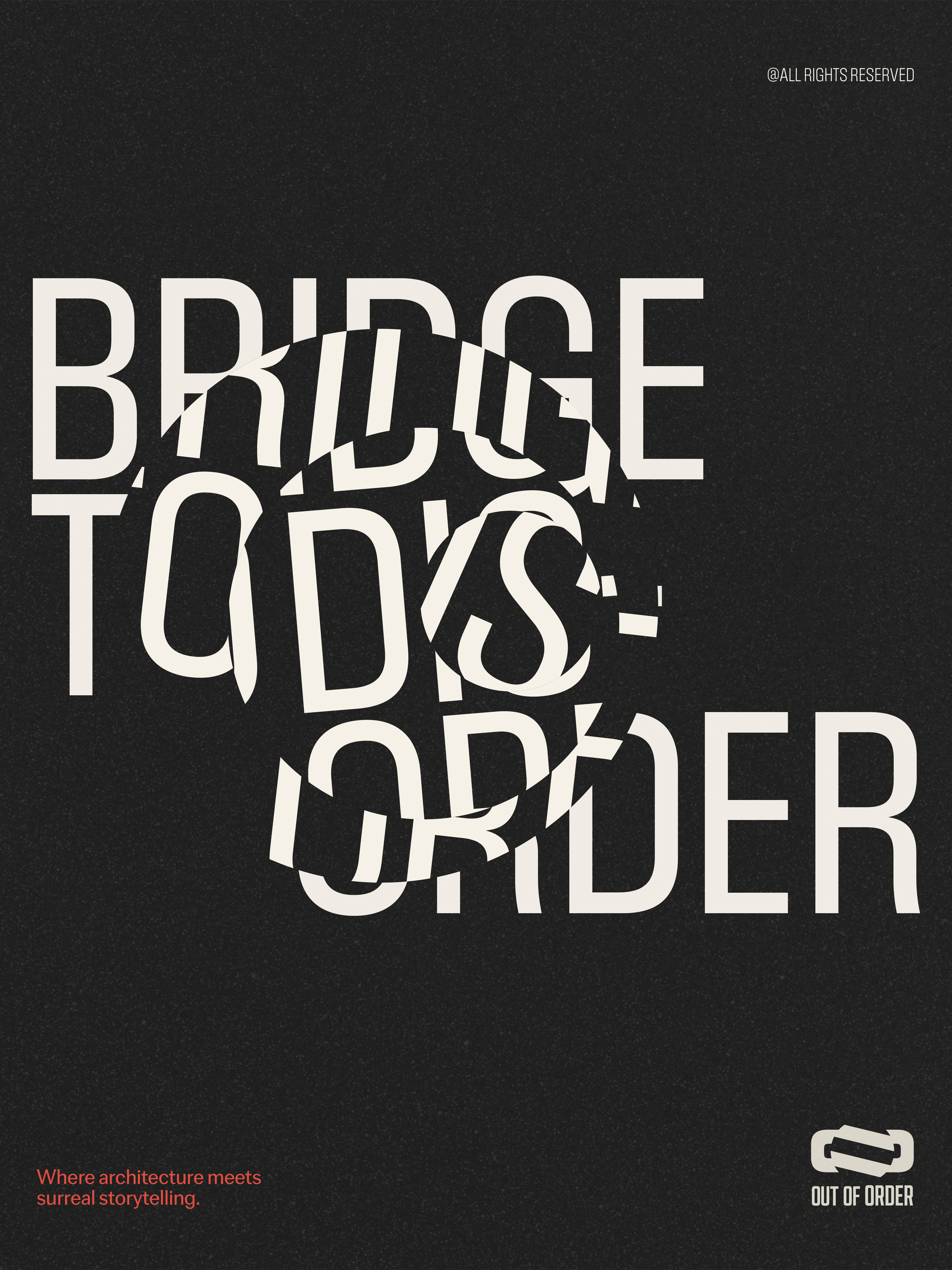
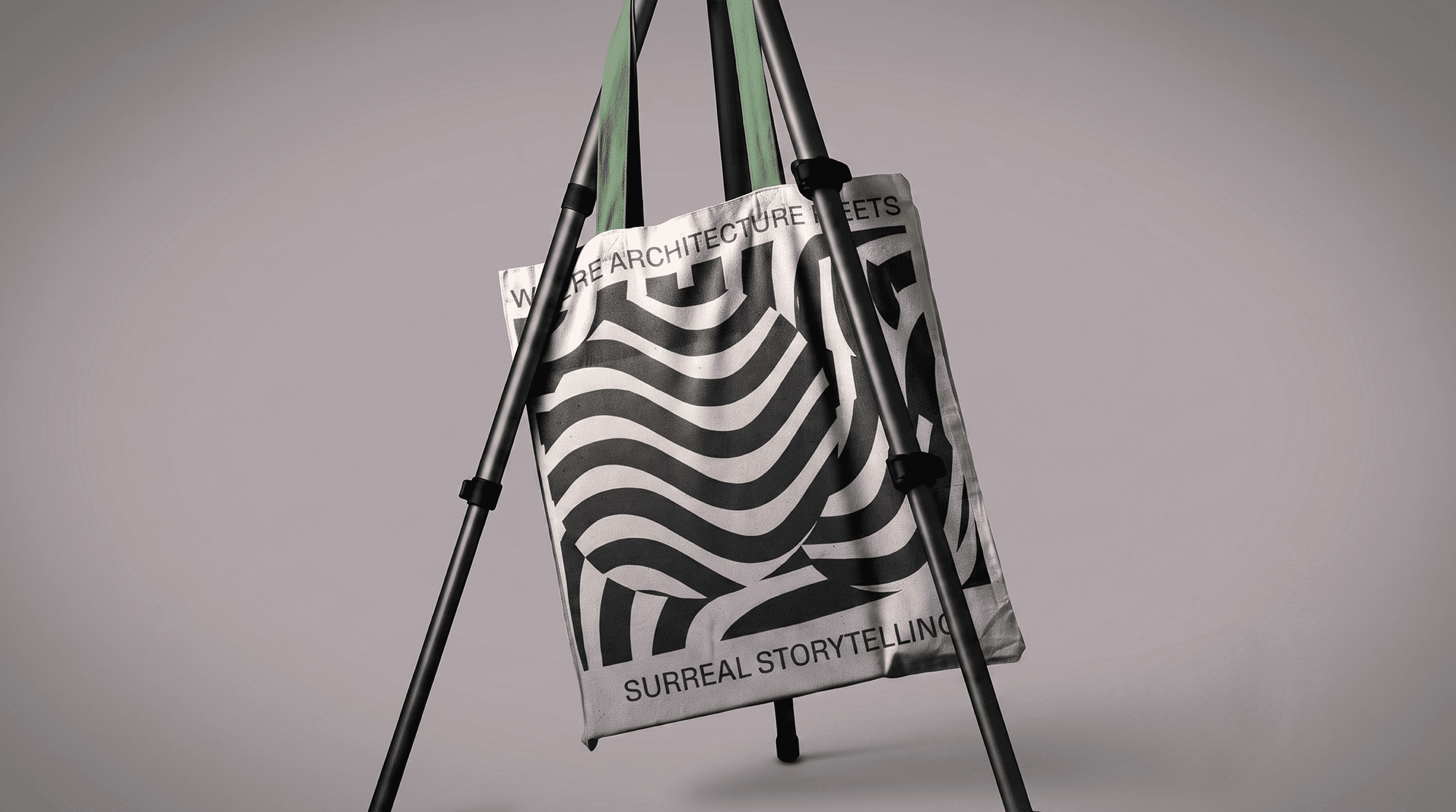
Distortion became a central principle of the identity. Rather than introducing surrealism through exaggerated or fantastical imagery, the system uses controlled disruption to alter familiar visual elements. Structure is interrupted, images are reframed and typography is manipulated to create moments of tension and curiosity.
Distortion In Motion
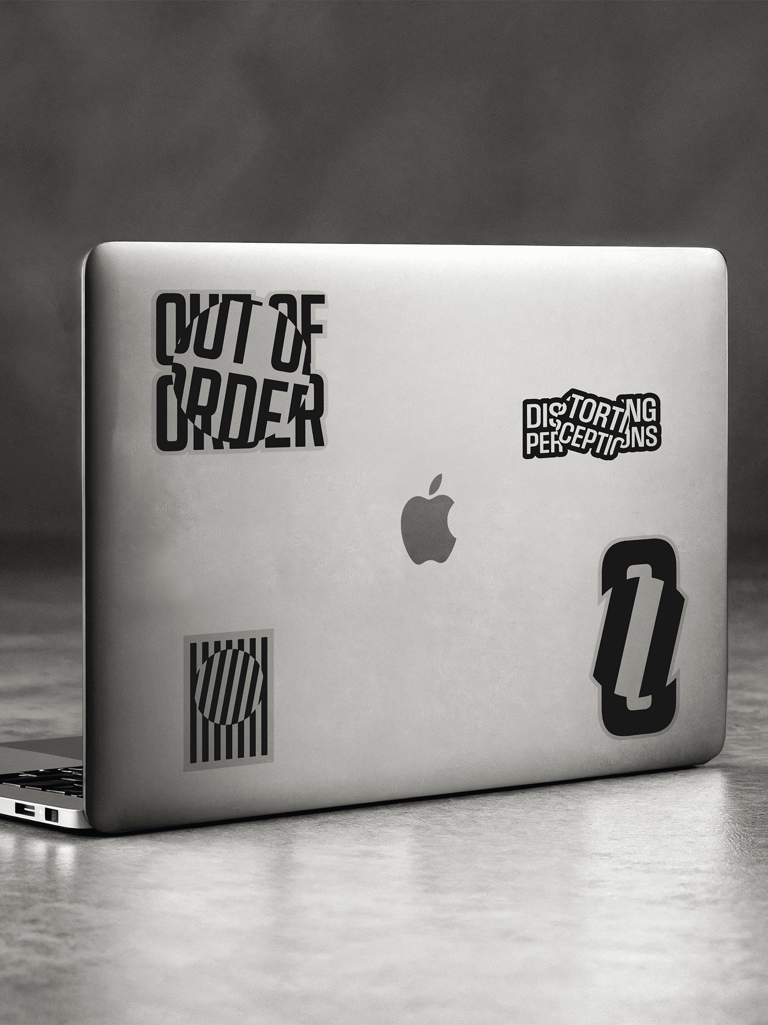
The identity was designed to extend naturally into motion. The same principles used across the static system become more expressive when movement is introduced. Lens forms rotate, elements shift and compositions reveal themselves progressively, creating a visual language that feels active without becoming distracting. This approach extends across presentation templates, animated stickers and social media content, giving Out of Order a consistent way to move between still and motion based communication.
Outcome
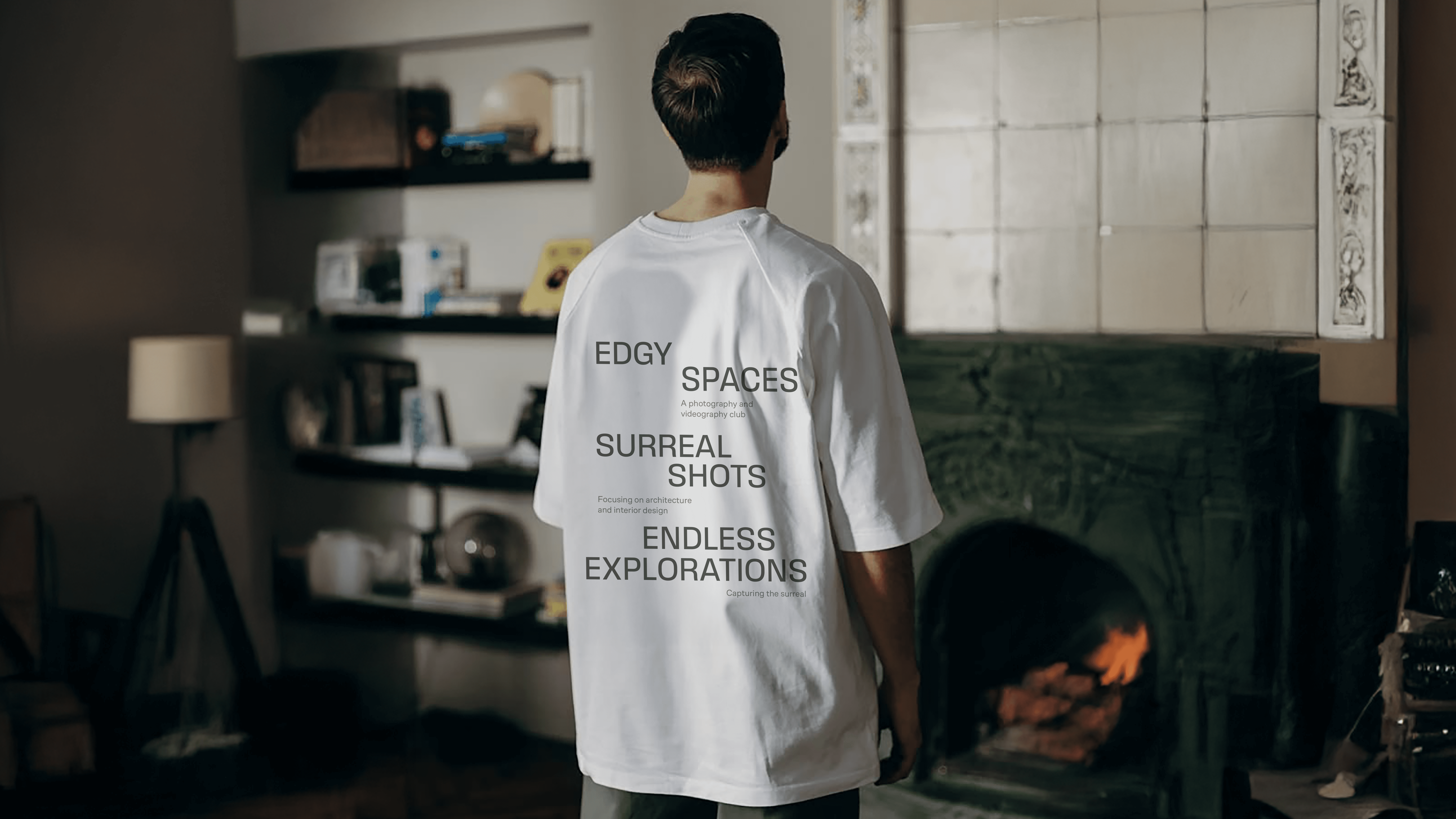
The identity functions as a lens rather than a decorative layer. It frames, directs and adds context while allowing photography and film to remain central. The visual system gives the work a recognisable point of view without competing with the spaces being presented. Across social media, presentations, merchandise and other applications, the same principles create consistency without relying on the logo alone. The framing device, distortion language and typography work together to establish a distinctive visual character that can adapt as the collective continues to create and document new work. The result is an identity that gives Out of Order a distinct way to frame, distort and reinterpret the spaces it captures.
Thanks to
Anushkha Advani, Hitesh Bhanushali, Hrithik Jagwani, Karthika Viju, Sarah Rose